We all find it harder to concentrate these days, but who can blame us? Our world is teaming with more facts, opinions and information than ever before; we very definitely live in an ‘age of information’.
It’s an age where we’re faced with more choices than ever before, and provided with more data from which to base our decisions. Data billows ever more expansive every minute. In just 60 seconds, we create:
>> 100,000 tweets
>> 8hours worth of youtube videos
>> 204,166,667 emails
>> and 27,778 blog posts (from Tumblr users alone)
Finding anything worthwhile amongst all that information would be comparable to finding a needle in a haystack during an ongoing haystorm.

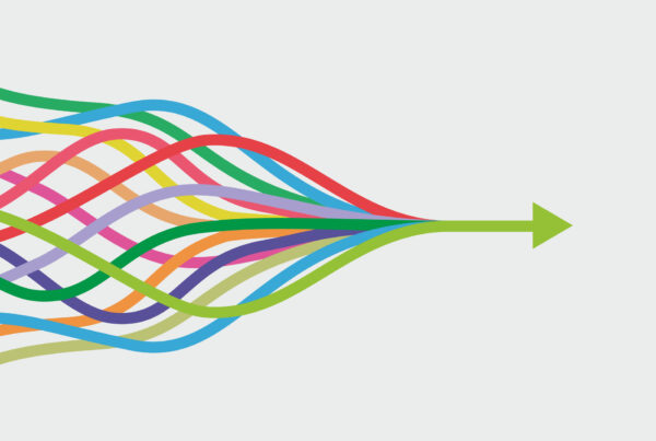
Infographicists are leading the charge against this bewilderment. Infographicists wade their way through data and use graphic design to streamline it into the simplest possible visual format.
Take my list of statistics above, for example. This list of facts and bid numbers was intended to impress and to support a message about the modern excess of data. However, in the interest of retaining reader interest (and aware how quickly attention wanes) I chose to use only 4 of of 15 potential facts. In text, 15 facts would be nicely skimable. It takes an infographic (like the one here) to get all the information across in one punchy package.
Great infographics are better than simply graphs or charts; they channel data into something that is instantly understandable and clearly persuasive.
I’ve been inspired by five Infrographicists who I believe are masters of the art. They are five individuals or organisations who source disgustingly endless excel datasheets, or dry factual reports, and create wonderfully vibrant representations of them. They have found the beauty in chaos and created order that we can understand.
This is not graphic design for marketeers or for brandspeople. It is design for educators, and design that will be vital if we are to steer a course through the age of information.
___________________________________________________
HERE THEY ARE, 6 BRILLIANT INFOGRAPHICS:
1 – Information is Beautiful
Of my six inspirations, David McCandless tops the chart. His book, Information is Beautiful, would be endlessly interesting if it weren’t constantly being challenged by ever-more impressive new graphics online. Here’s an example, but take a browse; informationisbeautiful.net

2 – TED Talk: Dublin Public Transport Map
By the end of Aris Venetikidis’ 16 minute TED lecture, an audience are vehemently applauding a local bus map. Before Venetikidis, riding Dublin’s busses to your destination took a mixture of sincere patience and blind guesswork. Venetikidis dived into the network’s tangle of information and came out with all the necessary details, neatly coded on one page.

Watch the 16 Minute Talk
3 – Sebastian Lange: Animated Typography
This video is inspiring more in its stunning execution than in its lucid ‘presentation of information’. Sebastian Lange and his Adobe After Effects software throw words at you, turning the meaning of words and phrases into thumping physical vibrancy. Might Lange animate a novel, perhaps?
What happened to the good old days when you could go into a coffee shop, ask for ‘a coffee’ and you’d get a coffee”? For those who’d rather moan than learn the difference between a mocha and a cappucino, Plaid-Creative‘s a poster instantly cuts through bewildering beverage jargon. All coffee shops should display one.

5 – Royksopp, Remind Me
Life, science, and modern humanity are charted in this hypnotically detailed music video. I hope this will one day be studied by historians as archive footage.
6 – Channel 4’s Paralympic LEXI
Complexity always stood between the public and the paralympics. There were too many questions, too many rules, how would we keep track in such a niche field? Channel 4′s inspired graphic representations of the complex ‘athlete classification’ scheme amply bridged this gap.
I’m on the hunt for some interesting data of my own, and hope to join the infographicist ranks myself in the not-too-distant future. Meantime, let me know if you’d found any of your own that are good; there are tonnes of great ones out there.